Skyline Optometry
Strategy • Messaging • Brand Identity
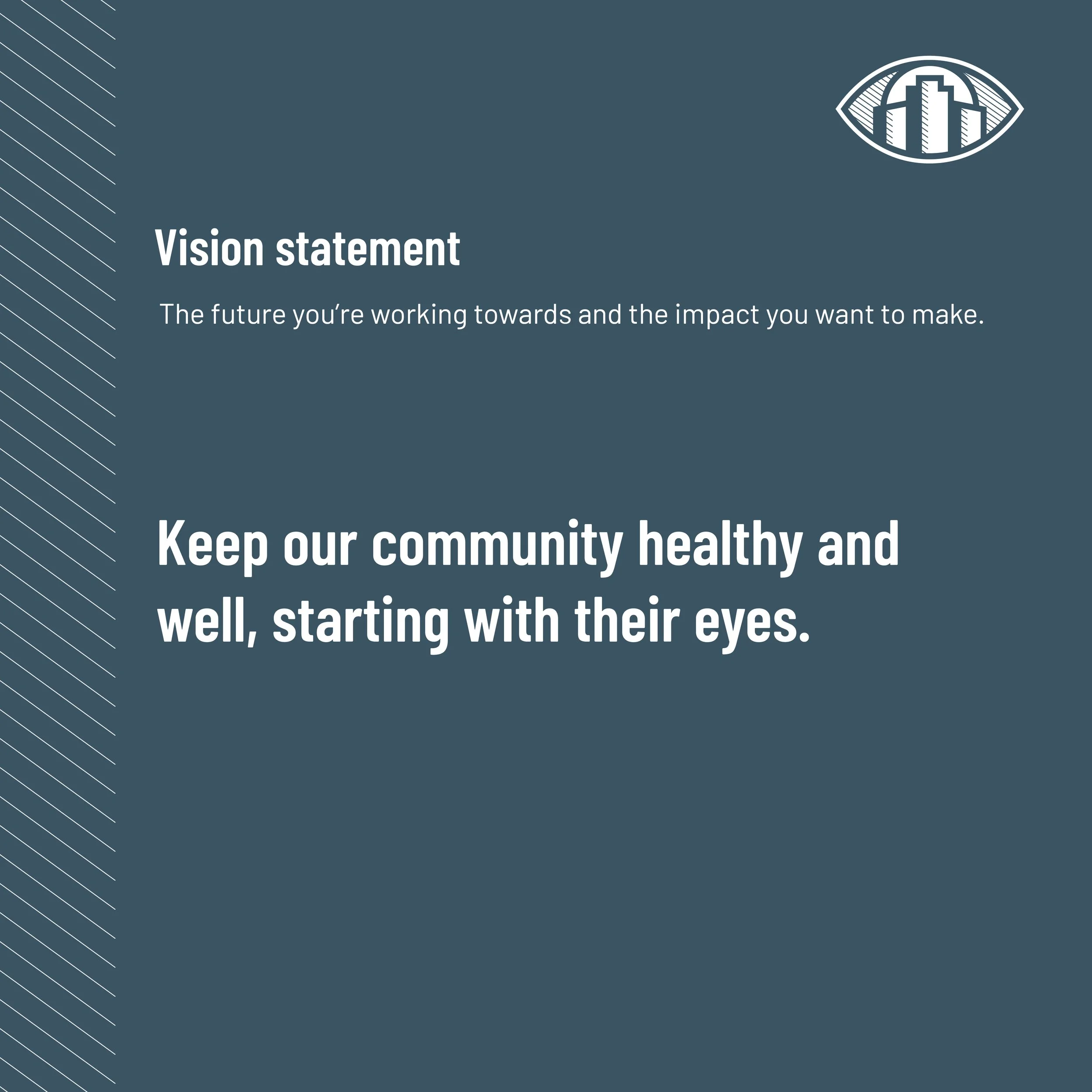
A community-focused optometry practice committed to protecting the long-term health and wellness of the people it serves..
The Challenge
Skyline Optometry needed a brand that reflected both its medical expertise and its deep commitment to the local community.
The challenge was to create an identity that felt modern and knowledgeable while still reflecting the practice’s warm, community-centered approach to care.
The Strategy
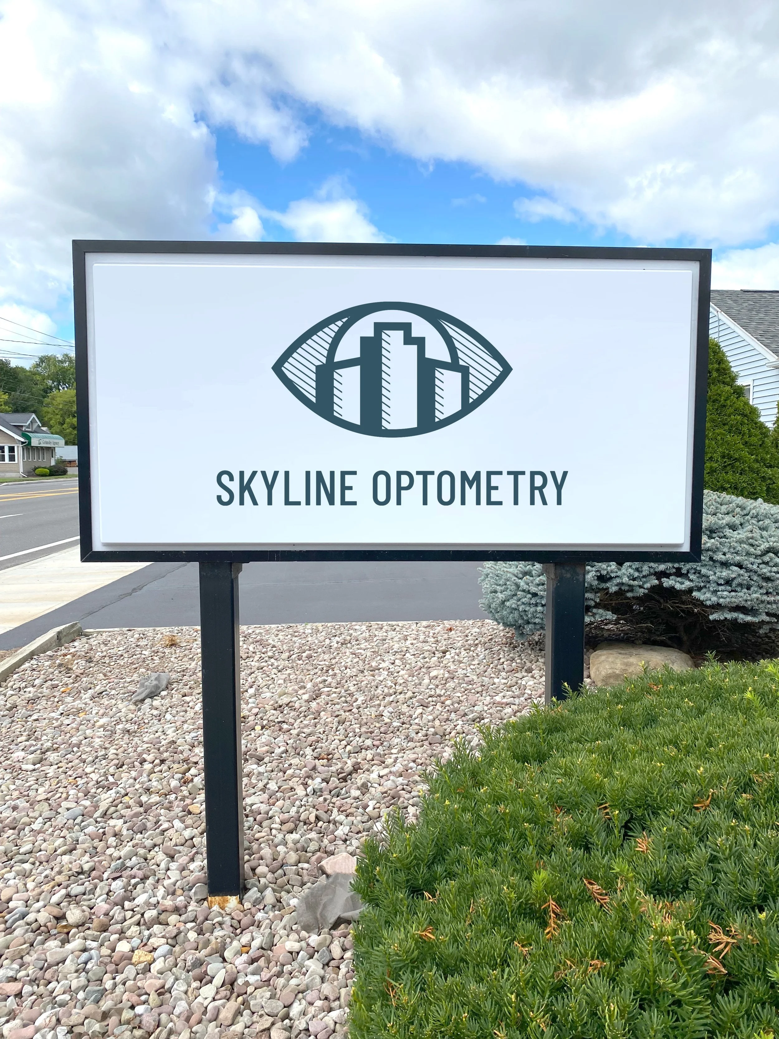
Center the brand around the idea of watching over the community.
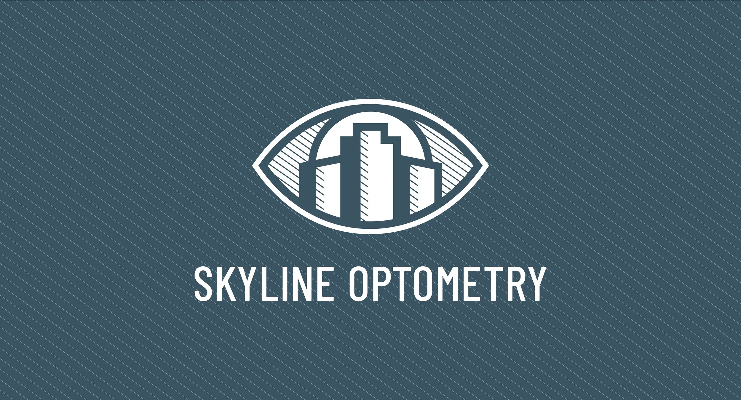
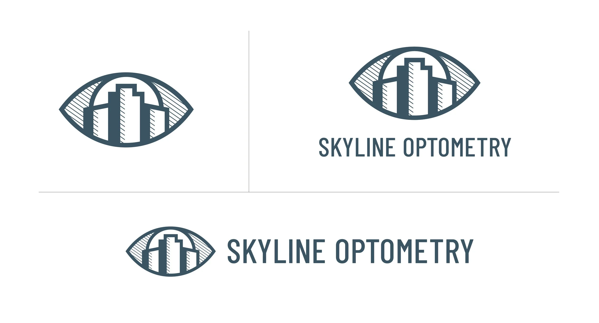
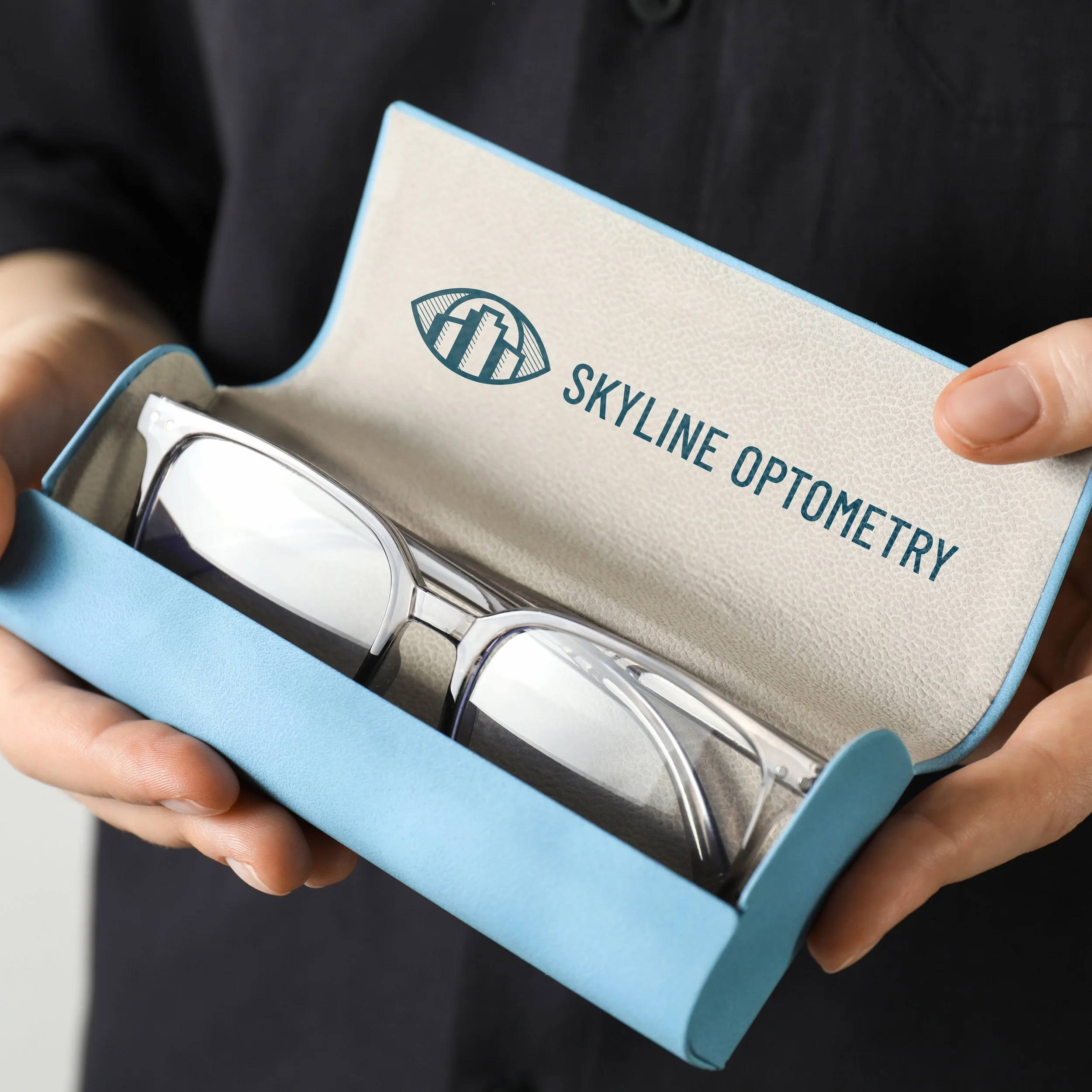
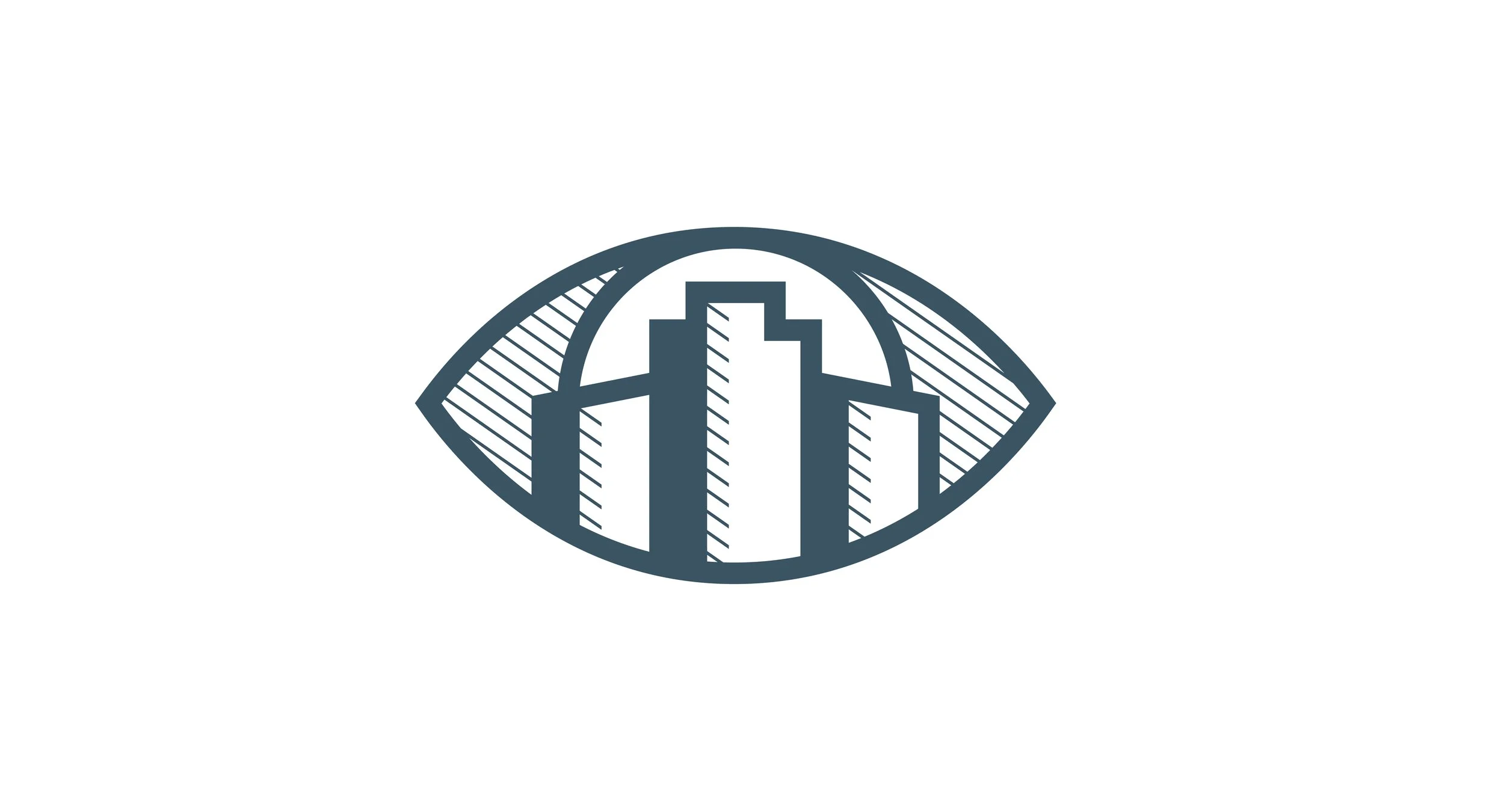
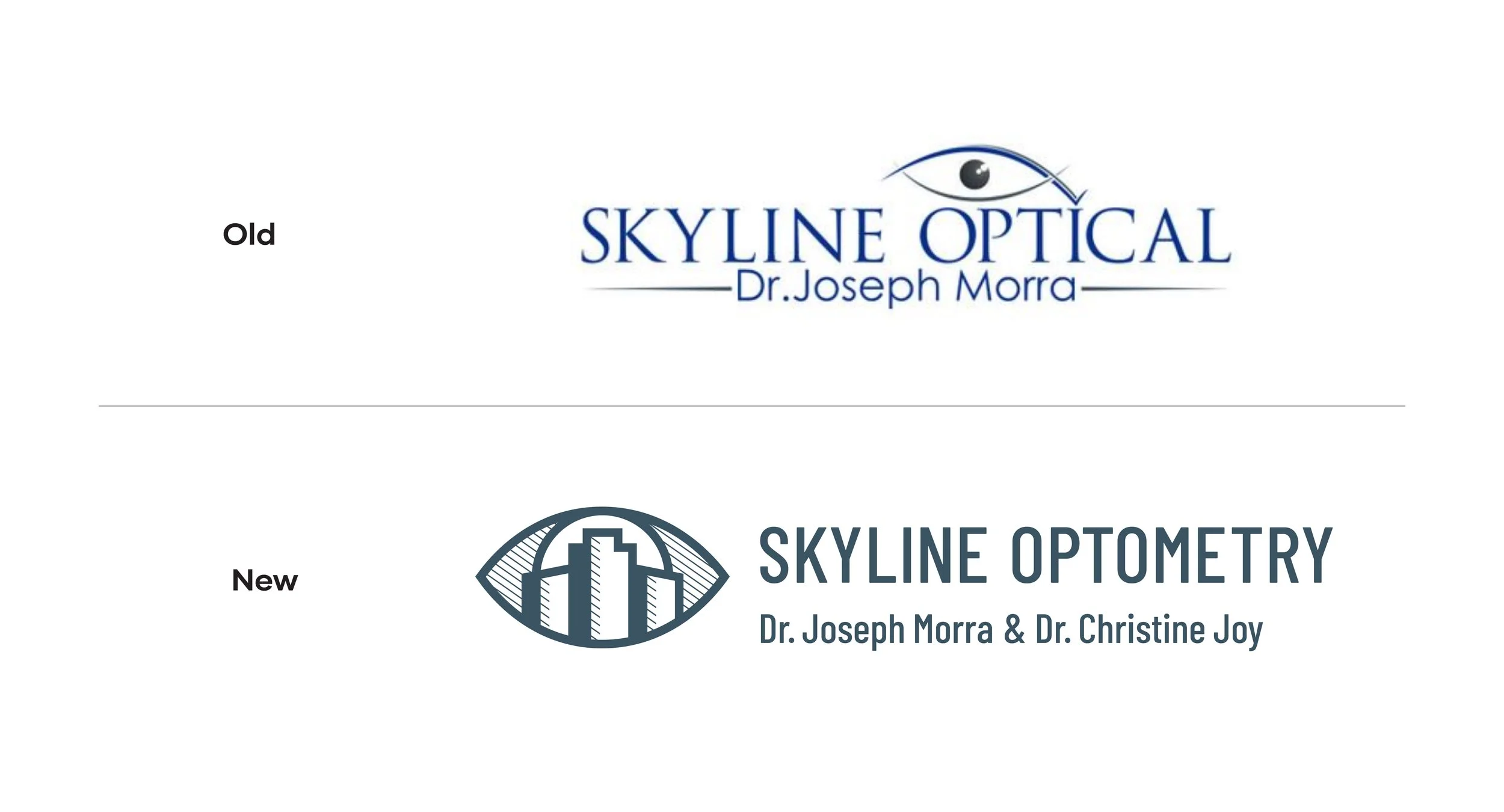
We used a skyline as the focal point of the identity system, placing it within the shape of an eye to symbolize protection, visibility, and care for the community being served.
The Work
Messaging
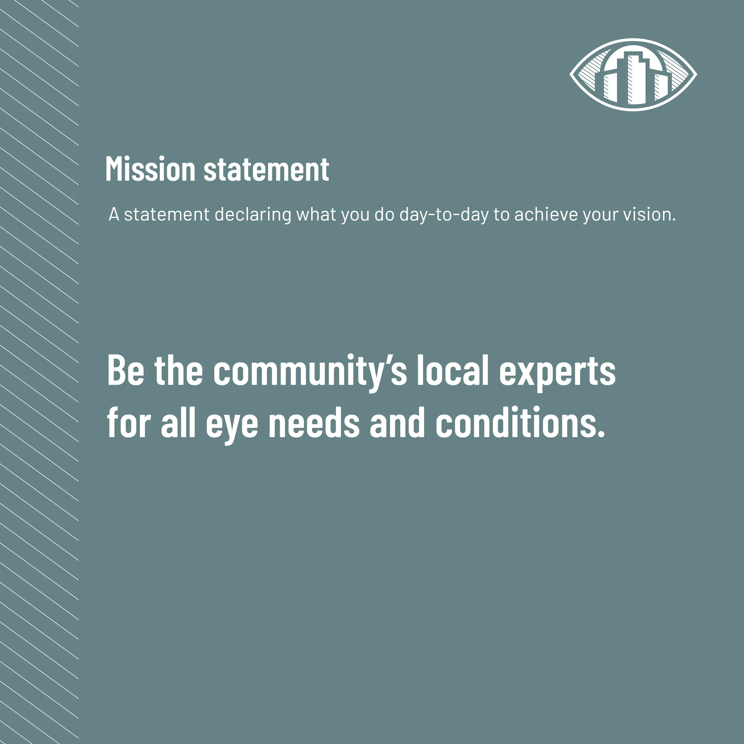
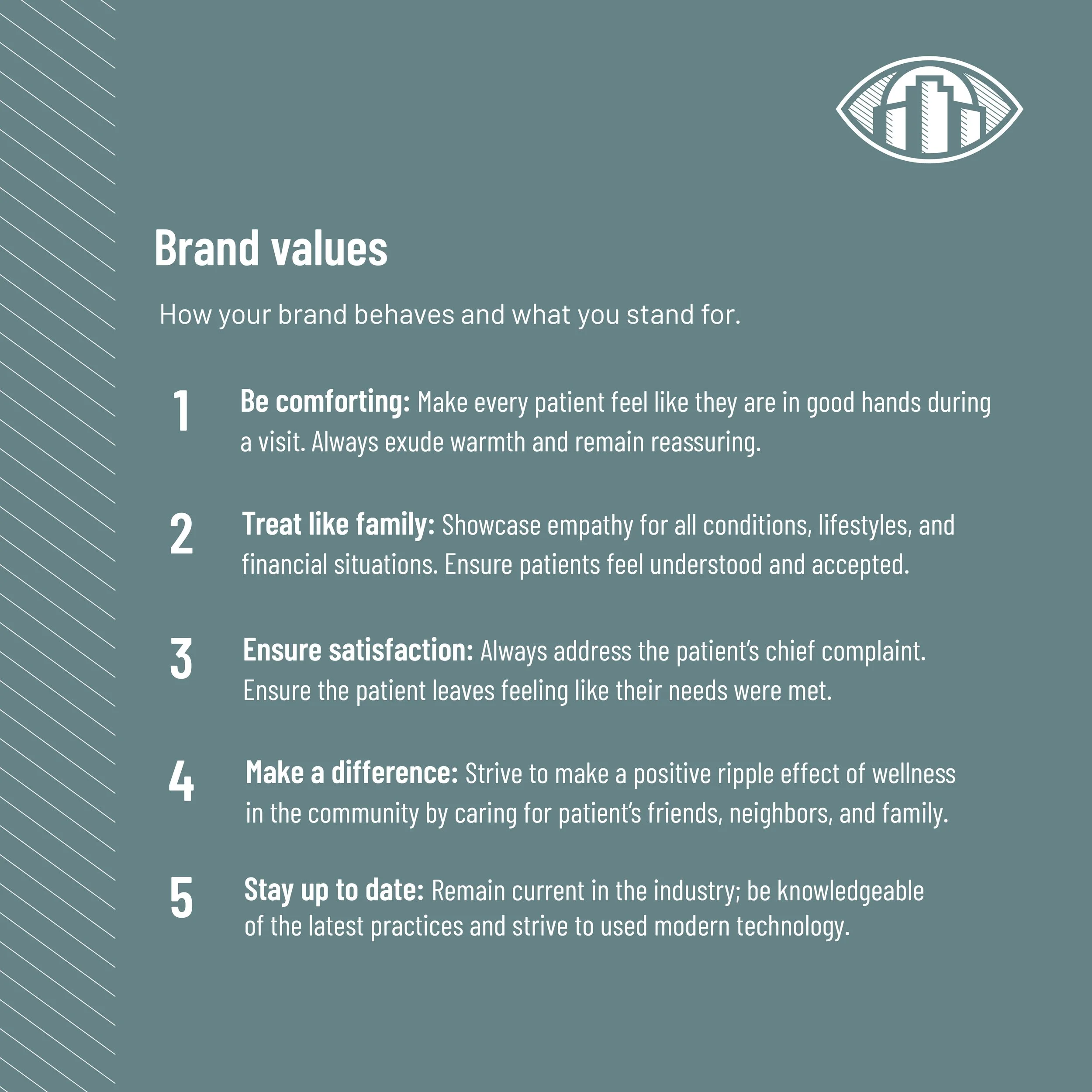
Defined a community-centered brand direction rooted in trust, comfort, expertise, and care.
Strategy
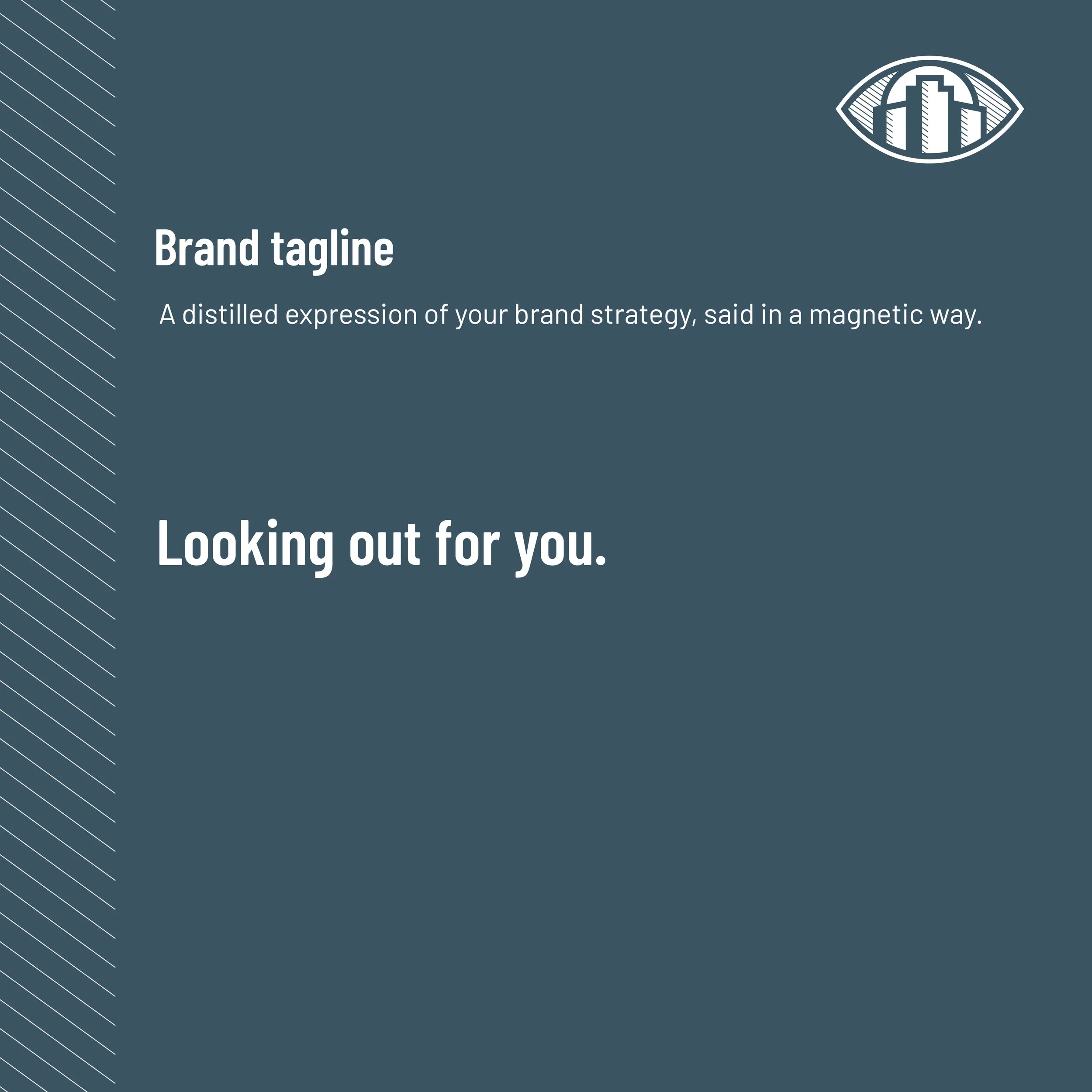
Developed the tagline “Looking out for you” alongside patient-facing messaging and brand values that position the practice as a more personal, community-centered alternative to corporate optometry models.
Identity
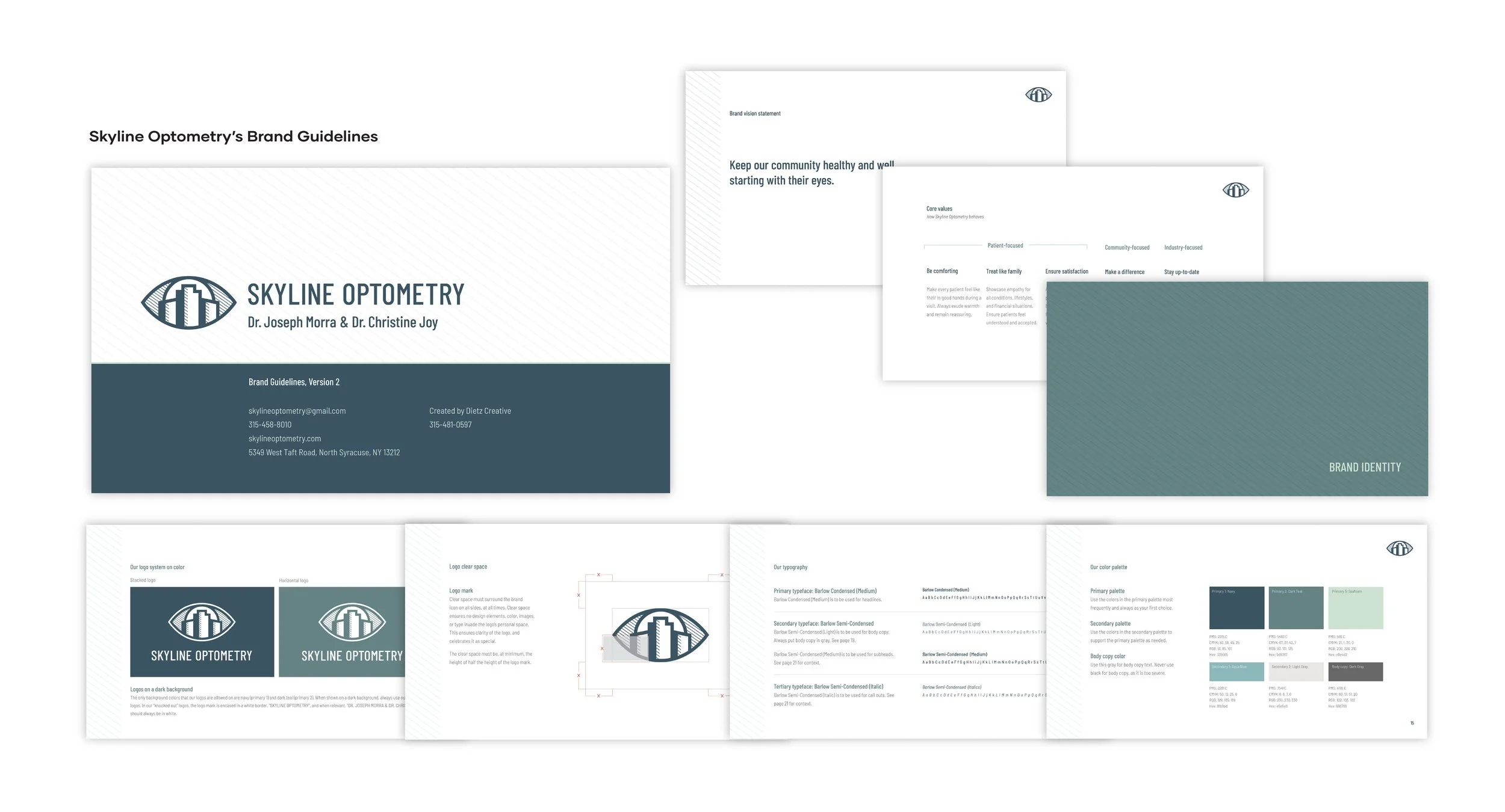
Designed a logo system that visualizes the brand’s strategy and a larger visual identity that reinforces trustworthiness and expertise through color, typography, pattern, and symbols.