
Little Roots
Strategy • Messaging • Brand Identity
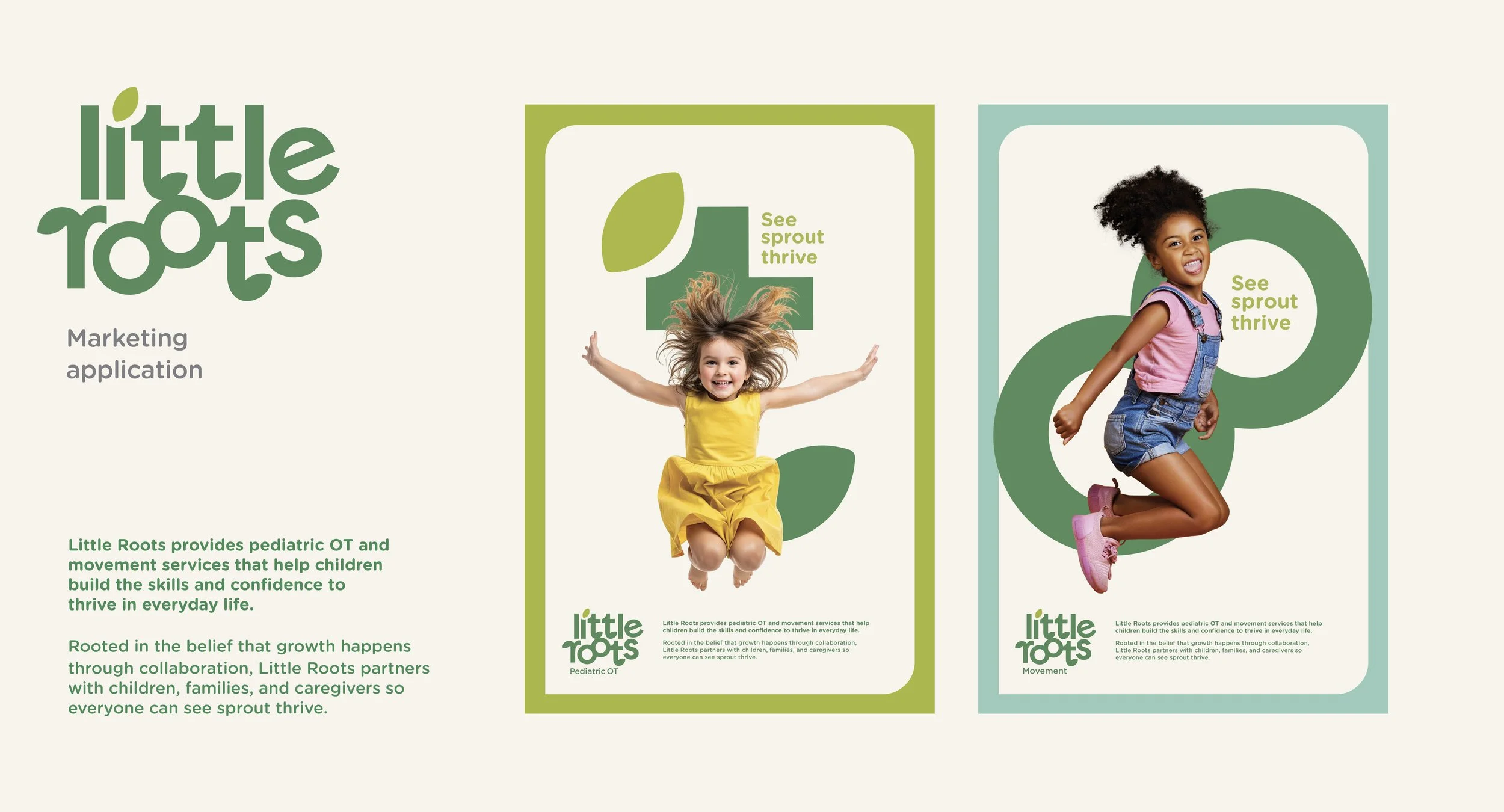
A pediatric occupational therapy practice helping children build the skills, confidence, and independence to thrive through family-centered care.
The Challenge
Little Roots needed a brand that could communicate a more holistic approach to pediatric care in a saturated market.
The challenge was to create an identity that felt warm and welcoming to families, established clinical trust, and built a flexible foundation for multiple movement-based services.
The Strategy
Build the brand around the belief that growth happens through collaboration.
We positioned Little Roots as a family-centered practice where meaningful progress is made possible through children, caregivers, and clinicians working together, creating a scalable brand foundation for future services.
The Work
Messaging
Defined a strategic foundation rooted in collaboration, family-centered care, and whole-child development.
Strategy
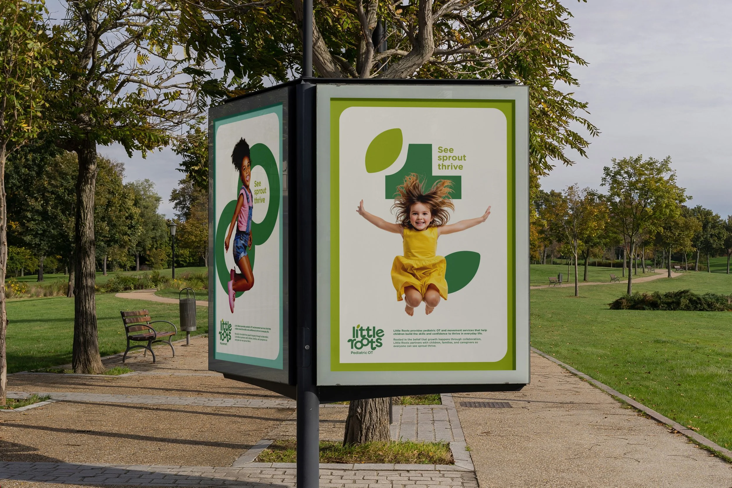
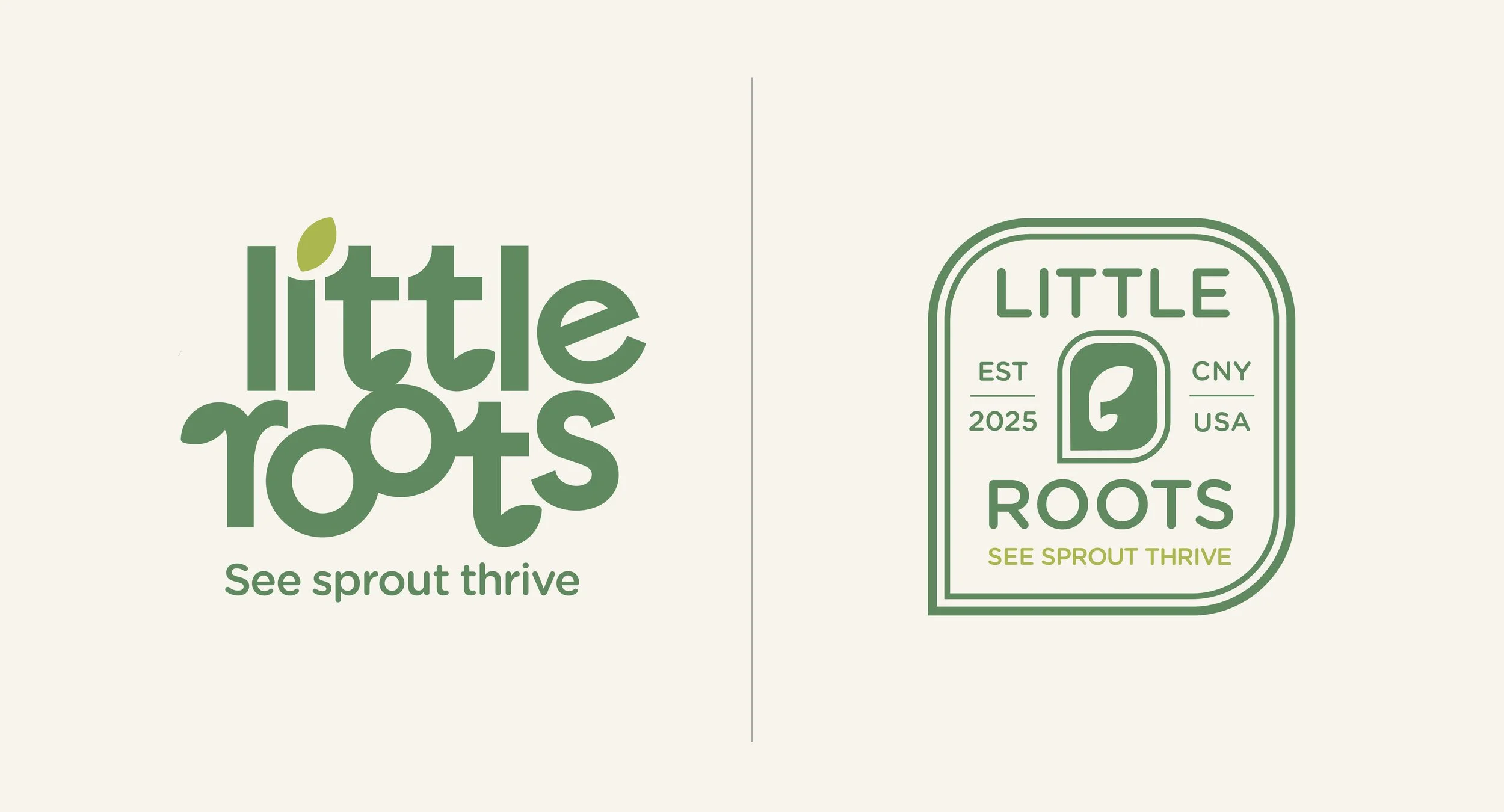
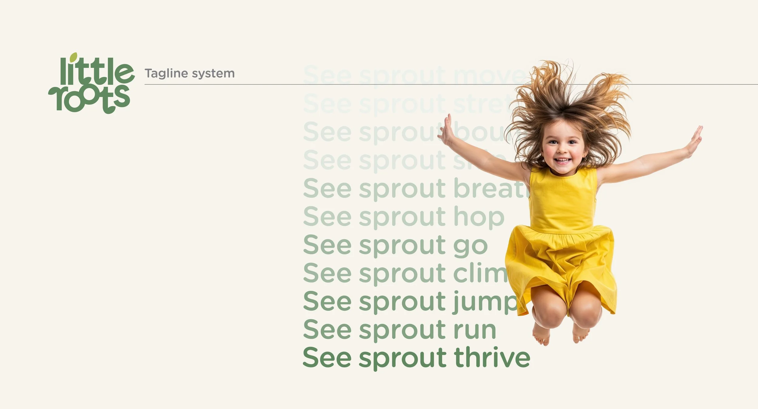
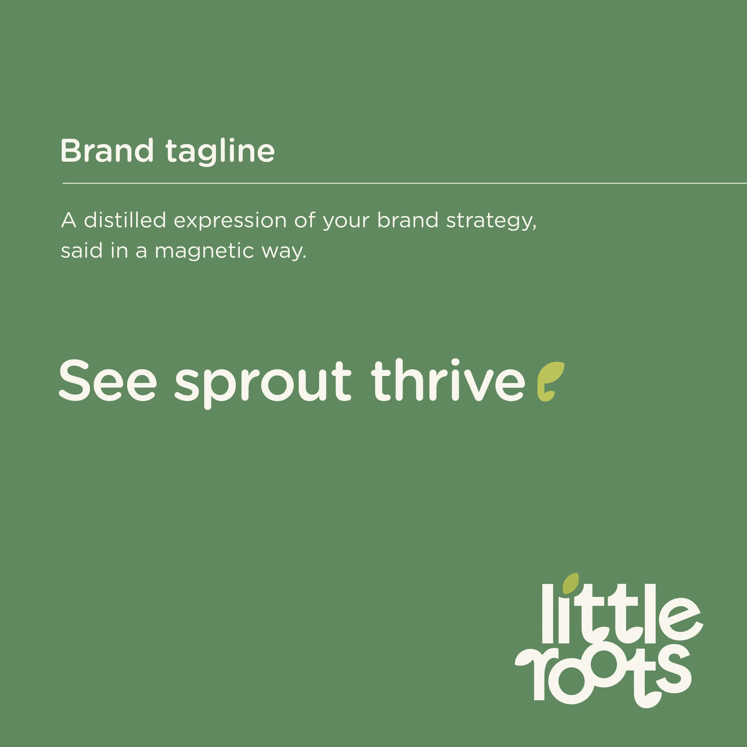
Developed the tagline "See sprout thrive," along with a flexible messaging system that celebrates developmental milestones while reinforcing the brand's core promise.
Brand
Architecture
Messaging
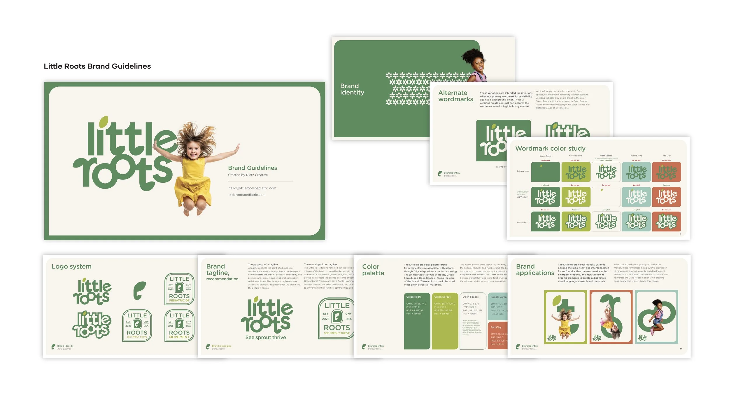
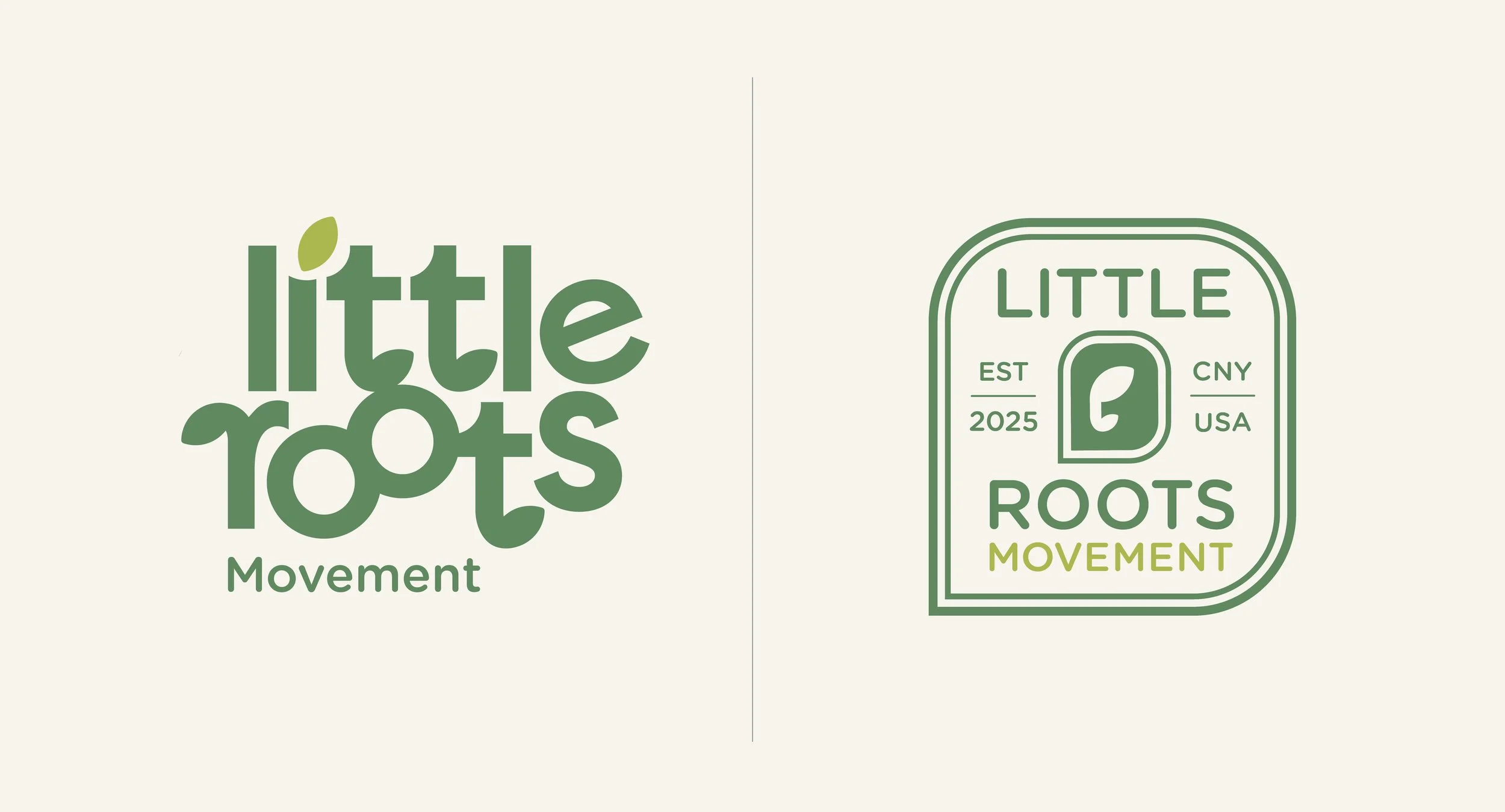
Established Little Roots as the parent brand, creating a scalable identity system that supports Occupational Therapy and Movement as connected sub-brands.
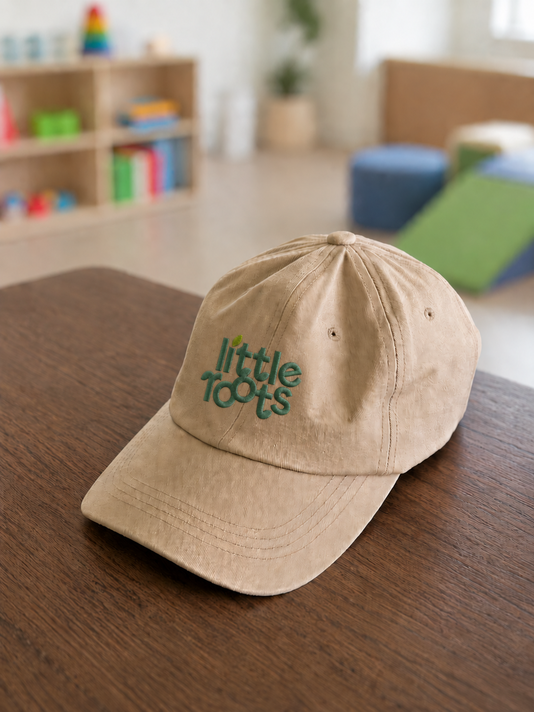
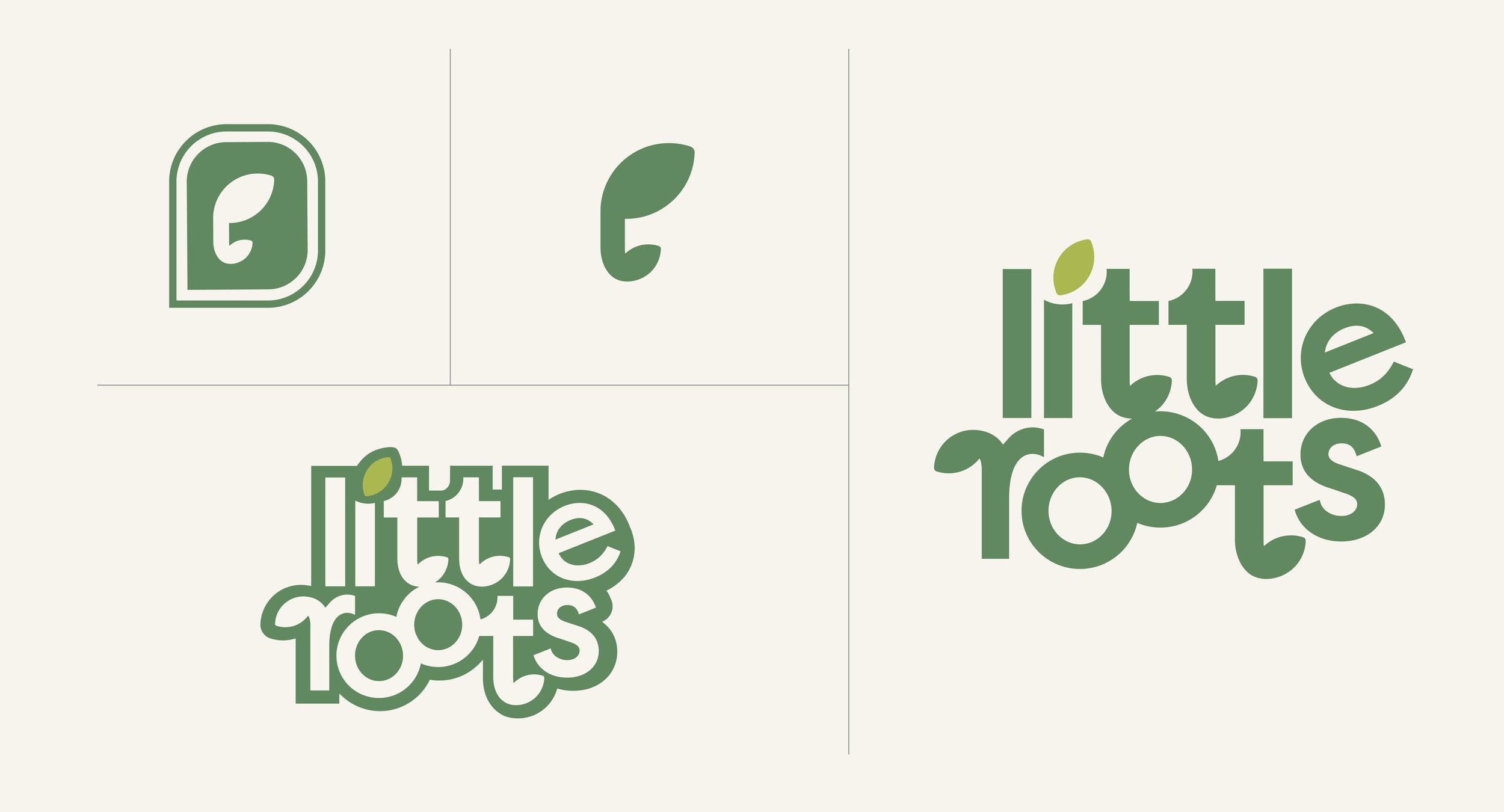
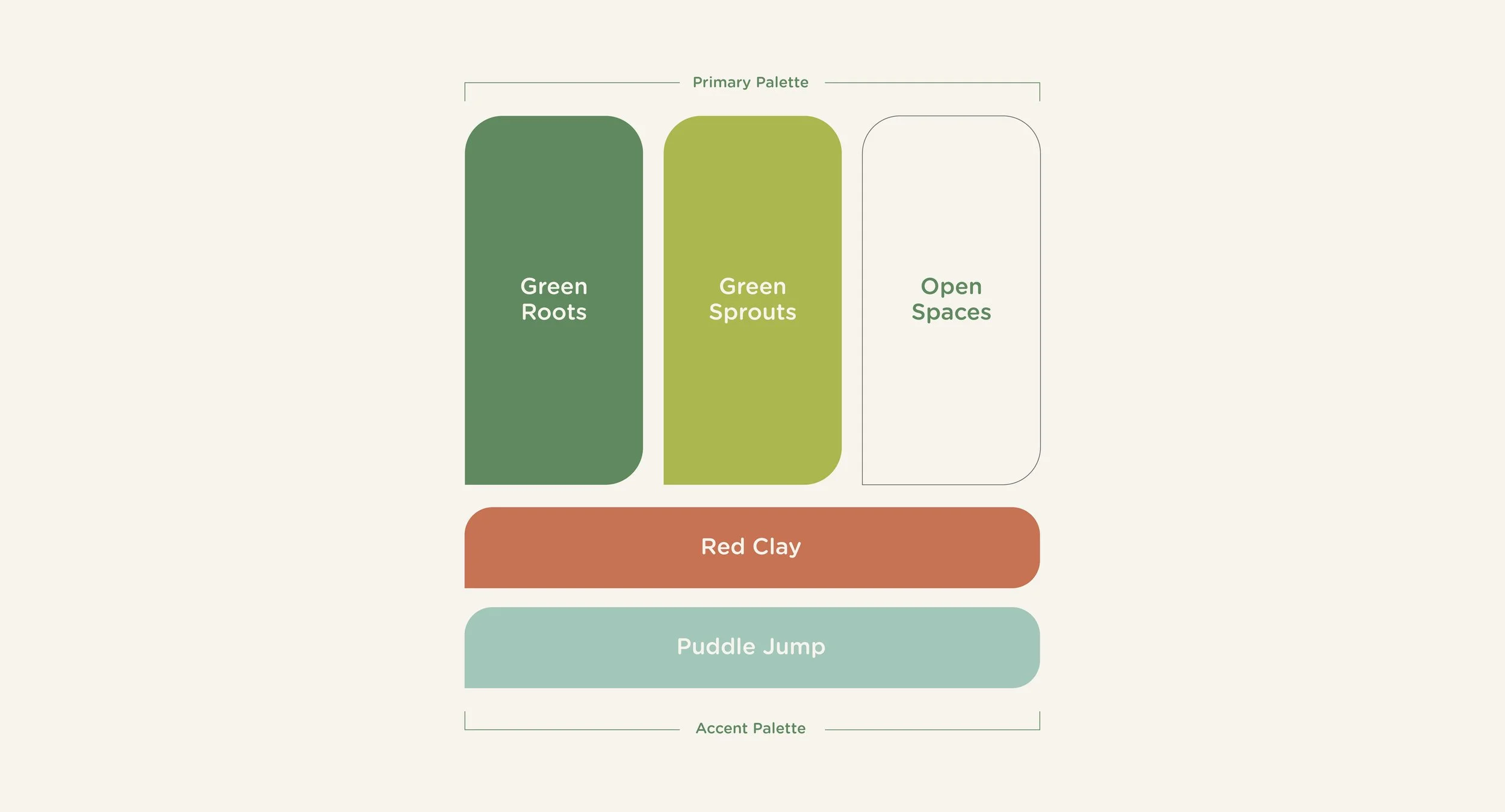
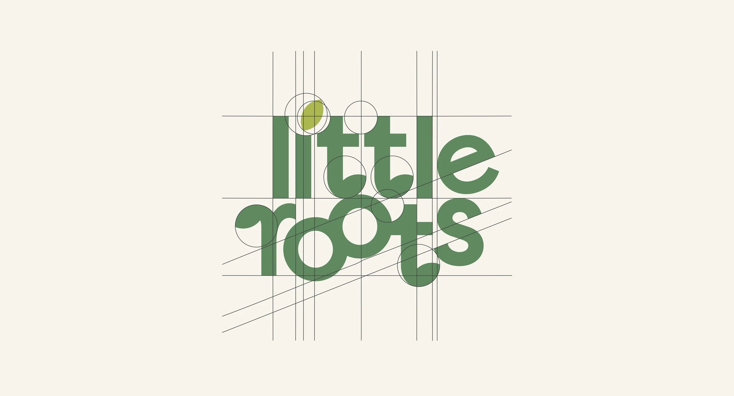
Designed an identity system inspired by roots, sprouts, and interconnected growth expressing the brand strategy through custom letterforms, an earth-inspired palette, and friendly typography.